Pearson
One Visual Voice for A World of Languages
Agency
true
Role
Visual Designer
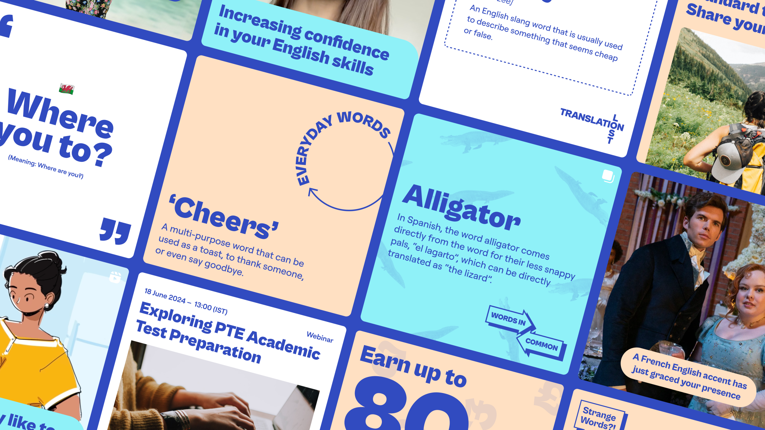
Pearson needed a social media refresh to engage 18–24-year-old language learners. I developed a visual concept that retained brand recognition while creating a more contemporary, youth-focused identity.
The visual style aimed to create a recognisable, adaptable social identity that connected with younger learners as well as being flexible enough to also work for corporate content. Oversized typography prioritised key messages, while bold colour blocks and layered geometric shapes created distinctive layouts designed to stand out in busy social feeds. A flexible set of visual elements allowed different post formats to feel connected without becoming repetitive.
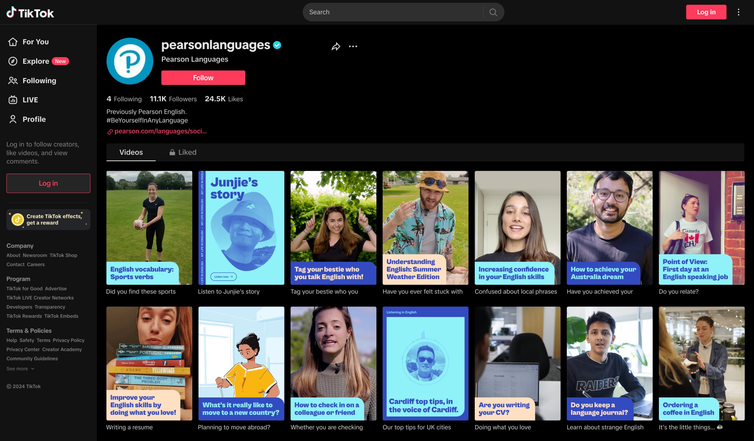
I explored content formats to make language learning more relevant to everyday life, including bite-sized vocabulary tips, cultural insights and commonly used expressions. Video concepts featured day-in-the-life stories, narrated content and animated typography, combining practical learning with movement and relatable experiences.
However, a wider business rebrand was underway, with new guidelines expected to supersede existing marketing materials, so the refresh was not progressed.
2026 © byfrequency